This page created 16 November 2014 and last modified: 20 July 2015 (hexagonal forts section added).
The original Roman "Notitia Dignitatum" compilation does not survive. Nor does the (?) presumably Carolingian copy of the Roman original through which the extent copies are descended. All the extent copies derive, whether directly or indirectly, from a manuscript in a codex once kept in a library attached to Speyer Cathedral in Germany, the co-called "Codex Spirensis". This Codex Spirensis is also unfortunately now lost, and has been lost since 1672 at the latest. It contained many other works in addition to "the" Notitia, one of which was also a "notitia", on the subject of the districts of the city of Constantinople. Another work was the only surviving copy of the military treatise called "De rebus bellicis". Nonetheless, the Notitia Dignitatum was by far the largest work contained therein, and comprised about half of the codex.
Copies were being made of the Codex Spirensis from 1427 at the latest, for this date is found in the now fragmentary Cambridge copy (manuscript "C"). Complicating the analysis of the illustrations contained in the Notitia is that it is apparent that at various times the Codex Spirensis was not the only codex contained in the library containing a copy of the Notitia, since sometimes derivative copies were stored there as well. Thus when a new copy was made, the copy need not have been taken directly from the Codex Spirensis, but could have been taken indirectly, from one of the previous copies also kept there. An analysis of the illustrations implies that some manuscripts, e.g. the Parisian copy (manuscript "P"), may have been copied in part from both the Codex Spirensis and at least one of the earlier copies (in the case of P, that copy is the Bodleian copy, manuscript "O", now in Oxford, and dating to 1436).
Further complicating the analysis of the illustrations is the problem that, as with many illuminated manuscripts, the various copies were each written by a scribe who was not the same person as the illuminator; which means for example, the captions for the shield patterns were not written by the person painting the corresponding patterns, greatly increasing the chances of a mistake being made in attaching the correct caption to the correct pattern. This problem is particularly apparent in the Vatican manuscript, V, where 21 shield patterns have labels different from those found in the other manuscript copies. The other copies themselves all show sure signs of having label mismatches, which were therefore presumably to be found in (and possibly introduced into) the Codex Spirensis version.
The surviving copies can be grouped into two broad styles in terms of their illustrations. depending on whether they show marked renaissance artistic characteristics are not. Compare the following illustrations, each showing the last picture of the Notitia, that accompanying the office of the Praeses Dalmatiae (i.e. Governor of Dalmatia).
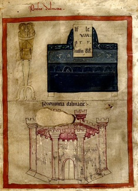
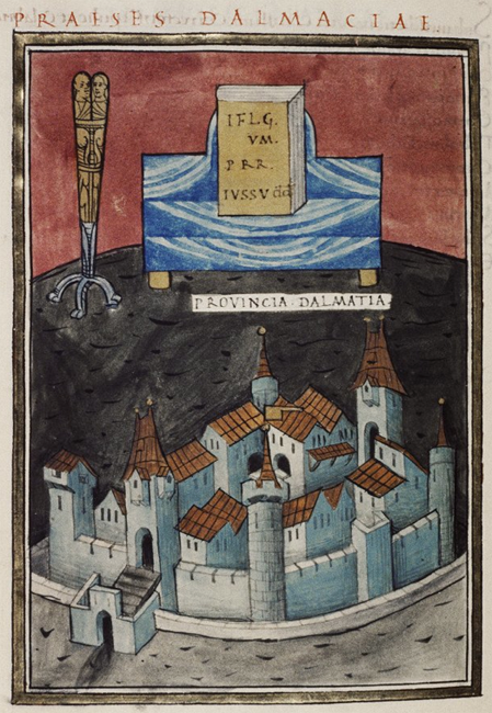
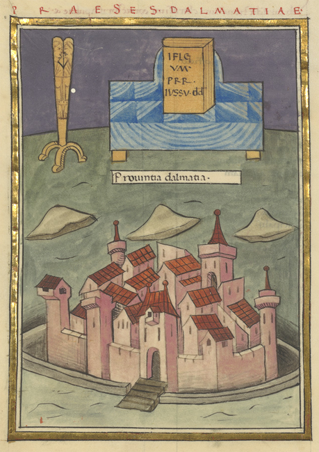
From left to right, these are taken from C, the Cambridge manuscript; from O, the Bodleian manuscript; and from P, the Parisian manuscript. Also compare the following three, taken from M, in the Munich manuscript; from W, the second set in the Munich manuscript; and from B, the Froben imprint.
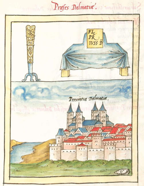
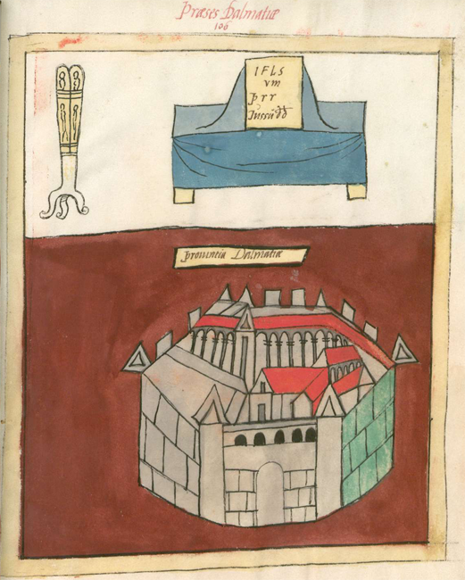
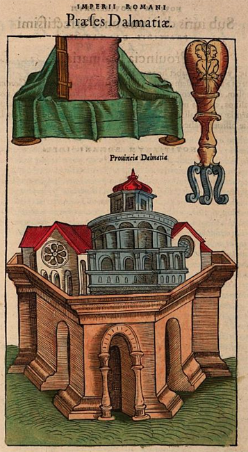
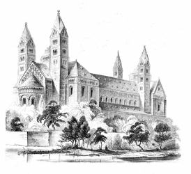
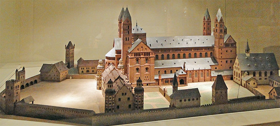
It can be seen that P and O are both very similar to each other, and betray clear early renaissance imagery in the depiction of the walled town that cannot have been found in a Carolingian manuscript, let alone a Roman one; the style is 15th-century Italian. M similarly has renaissance-period imagery, although the style here is later, and German; interestingly, this particular illustration would appear to depict nothing less than Speyer Cathedral itself as can be seen by comparing it with the illustrations below.
|
|
|
Public domain image. |
Photo by "Dontworry" and used under CCA 3.0 license. |
The remaining fragments of the Frankfurt manuscript, manuscript "F" (and which do not include the Praeses Dalmatiae illustration), appear to be illustrated in a similar style to M; they are a single leaf ("Ff") that now resides in the Goethe University in Frankfurt am main in Germany, and two more leaves ("Fl") that now reside in the Leiden University library in the Netherlands. In contrast, W shows a more stylised hexagonal structure that lacks much in the way of obvious renaissance embellishments; it is known that the man who first obtained what is now the Munich manuscript from Speyer Cathedral, the Elector Palatine Ottheinrich, specifically asked to be provided a copy with "old" pictures.
The Froben imprint B also shows clear renaissance embellishments, albeit 16th century rather than 15th. Although it does at least partially retain the hexagonal walling shown in W, whether this would be recognisable in the absence of W to compare to is however debatable; it is regrettable that the Froben illuminated manuscript from which the Froben imprint was copied is currently lost. Like W, the Cambridge manuscript, C, also shows a hexagonal walled structure, although the tower machicolation (embattlements) would appear to be contemporary. It is therefore very much to be regretted that so little of C has survived, and in particular, none of the sections showing shield patterns (although a 19th century copy of one such page has survived, and it is tantalisingly different from the equivalent page in W...).
In general, the degree of renaissance embellishments in the shield patterns matches that of the illustrated buildings, with W showing the least. Unfortunately, the pictures in W, despite ostensibly having been (indirectly) traced from the Codex Spirensis, were executed with a notable lack of care. In many places, for example, it can be seen that the painter/inker has departed from guidelines that have been pre-drawn underneath, and in other places, details that are clearly visible in other manuscripts have been simplified to the point of near-incomprehensibility (e.g. the two human figures depicted here). Further, M has many problems with its surviving colour palette: its yellows are rather pale; indigoes/purples are almost always faded to maroon/pink, but rather maddeningly, occasionally to blue(ish) instead (e.g. here), or even worse, simply left white (e.g. here), which sometimes happens with other colours too (e.g. here). Sometimes adjacent colours are simply reversed from what is seen in (most) other manuscripts (e.g. here). And sometimes objects in the shield patterns are just bizarrely interpreted. For example, the pattern labelled Grati which in the other manuscripts features two red-brown canids facing each other, possibly foxes, in W has two rabbits, not an animal noted for its martial qualities. Further, the countershading present in M and Ff (and reversed in B) has been misinterpreted in W as not a lightning of the pelts of the animals' underbellies, but a lightning of their rear legs.
The patterns of O suffer somewhat in the greens being depicted in a very dark shade, appearing essentially black in places, but in general appear to have the fewest obvious "mistakes" when compared to other manuscripts. Purples/indigoes usually appear more on the dark-blue side than the purple, but very occasionally lavender-grey (e.g. here); colours are very infrequently aberrant (one such exception is here). Unfortunately, the currently-available on-line images suffer both from low resolution and poor illumination (the gold leaf in the picture frames hardly gleams at all), having been converted from now rather old microfilm slides. Hopefully this will be rectified by the Bodleian Library in the future.
The patterns of P are very similar to those of O, but have been executed with not quite as much care; more mistakes are to be found among them (e.g. the cross missing here). The patterns in P appear to have been mostly copied from O rather than directly from the Codex Spirensis; when O differs from W, then P almost - but not always - follows O, implying O was occasionally not available for copying. The labels of P also appear to have more spelling mistakes than those of O. Nonetheless, the colours of P are particularly good (although indigoes or purples are almost invariably shown as dark blue without any red tint), and the currently available on-line images are extremely vibrant.
The shield pattens of M, unlike those of O and P, show numerous renaissance embellishments: clothing, for example, is invariably depicted in a more contemporary style (e.g. here). Further, M has even more colour problems than W: not only are its yellows rather pale, but all its greens have faded to yellow as well, albeit sometimes darker than what the "real" yellow shows. Indigoes/purples/dark blues are almost always faded to maroon or pink (only a few still have a trace of blue left, such as here). It is thus particularly unfortunate that Seeck's in his widely-consulted edition based his shield patterns on those of M (the earlier edition of Boecking was based on those of W).
The shield patterns of B show perhaps even more in the way of renaissance embellishments than those of M. Indigoes/purples/dark blues are consistently depicted as purple; light blues remain blue. A few shield patterns are markedly divergent from those depicted elsewhere (e.g. here), and some are displayed in a different order than in the manuscripts. They are also almost invariably printed with their facings reversed, as if the illustrator was unaware the printing process would reverse them. Nonetheless, they do occasionally show a significant detail lost elsewhere, such as here.
The surviving shield patterns of Ff not only show typical renaissance embellishments (especially here) but are damaged; in many examples, they are so heavily damaged that details are lost. Further, the colours are all faded: reds and greens have fared the best; yellows have essentially disappeared; and while indigoes/purples have apparently kept their shade, their tone is faint. The proportions of the patterns often look pleasing to the eye (e.g. the position of the "boss" here). Interestingly, the number of patterns per page is markedly different from the other manuscripts (but note that the Trento manuscript W3103, Maier's "T", which does not have the shield pattens illustrated, does however have blank spaces left for the patterns to be inserted that correspond to the same variant spacings as found in Ff).
Therefore it can be seen that no one manuscript set of shield patterns can be considered "the best"; each must be evaluated on its own merits with regard to any particular shield pattern.
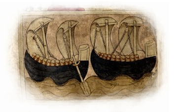
Incidentally, regarding the hexagonal characteristics of the illustrations of the forts and walled towns in the Notitia, this seems to have been something of a late Roman visual motif somewhat divorced from real-life practice (I know of no Roman fortifications with a hexagonal ground plan). It seems to have developed from attempting to show fortifications 3-dimensionally in limited spaces, such as coins. Compare the following four argentei (silver coins), each approximately 19 mm in diameter, minted during the Tetrarchy.
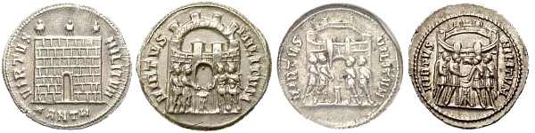
Left to right: Antioch mint, 297; Trier mint, 294; Rome mint, 294; Rome mint 294.
Images taken from www.forumancientcoins.com.
That on the left shows a typical frontal depiction of a gated wall with no hint of perspective attempted in the depiction of the fortification. The other three, in addition to showing the four tetrarchs sacrificing, make an attempt at introducing some sort of perspective into the scene. The first, from Trier, showing a wall with eight turrets is not very successful, not least because the turrets are not depicted vertically. That the walling closest to the observer is depicted flat while that further away is strongly curved also doesn't help. The next shows six turrets, and although the walling closer to the observer is depicted flatter than that to the rear, it is an altogether more successful attempt. Finally, that to the right gives an equal degree of curvature to the front and rear walls, essentially making the circuit a flattened hexagon. This kind of depiction seems to have become widespread. The 5th century Tabula Peutingeriana, depicting the way-stations of the empire's road network and preserved in a 13th century copy kept in Vienna, shows (left) the city of Aquileia in such a style:
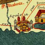
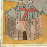
One may compare this with the city, believed to be Aquileia, fronting the section in the Notitia concerning the Comes Italiae (right).

Return to my Notitia index page.